
What is it like working as a team?
S: We were friends before we started to work together so we’ve always had a great rapport. The way we work on a project is that just one of us heads the project but we work together conceptually - pulling inspiration, shopping…
L: We actually finish each other’s sentences, so we have a good thing going on.
What is the process of working with Nate?
Nate will start a design and meet with us to discuss a projects concepts. We are the day-to-day people and are the ones who talk to the clients daily. We complete his creative ideas, but there is a lot of collaboration and we are really creating together.
We all are so comfortable with each other so we aren’t afraid to say “That’s a terrible idea!”. We can be very honest and open.

How has working collaboratively influenced with your own aesthetic and style?
L: All three of us have the same aesthetic. We definitely gravitate towards the same things. Nate might be more masculine or rustic and Sasha more modern and bright, and me more traditional, but we all learn from each other and infuse our personalities into the project.
S: I would say Lauren and Nate have influenced me a lot. I didn’t have a great understanding and appreciation of antiques and Lauren, whose parents own an antique business, has that background and she has educated me. Nate does amazing floor plans and positioning of furniture and I learned a lot from him in terms of that.
L: I would say Sasha does go a little more modern and funkier than I do and has influenced me that way. And she is a genius with color and palette and has taught me a lot about that. Nate has really taught me to style a space and make it much more interesting with accessories and adding layers to it.
Do you ever ask "What would Nate do?" or “What would Sasha or Lauren do?”
We collaborate on everything together so we actually ask each other, “What would you do?”

What is one piece of furniture or accessory people underuse?
Benches or a stool. We’ll tuck a pair under a table and clients like this because it adds a layer and is functional since you can pull is out for seating.
People also underestimate lighting. We use 99 percent vintage lighting and it functions like artwork In the home.
If you could design a space for anyone who would it be and what particular space?
We both love fashion and we often talk about what different fashion designers houses look like. We love Lanvin and wonder what Alber Elbaz’s house is like. He is such a genius with texture and color, and drape, and we’d love to collaborate with him on a space.

What was your favorite room/house/building when you were growing up?
L: I think for me it was my grandparents apartment. I think back about it now that I have been working in the industry for so long. It’s eclectic with fur pillows, and leopard print, and an amazing collection of art plus artwork that my sister and I did. It is chic and not dated. I always adored it.
S: I would say the Art Institute of Chicago. I used to go there when I was little. My parents would take me on my birthday and I was so inspired by all the art and would fantasize about what artwork I could have in my own home.
What style/period are you most afraid of but would love to try your hand at?
The only thing we are probably afraid of is minimalism. We both prefer to live in an environment that is layered and cozy. Minimalism shows off pieces we love, but it would be very hard to limit it all.

If you had to hire someone else to design your home who would it be?
We are both huge fans of Jacques Grange and love the houses he did for Yves Saint Laurent and would select him.
If you had to spend $25, $250, and $2500 on 2 items respectively to make a big bang in a room, what would be they be?
For $25 we’d probably say print out a favorite family photo in black and white and give it a prominent position a room, with a white frame and white matting. For $250 we’d hunt down a great vintage chair on eBay and put a bright fabric on it—we love a pop of yellow or kelly green. For $2500 we’d add an outstanding wall covering. We love grass cloth—it adds so much.
How often do you rearrange your own furniture?
L: I actually don’t move my furniture a whole lot. I move it and bring it back to where it originally was. But every time I bring something new in I move things around and I won’t go to bed until everything is in the right place.
S: I move mine around all the time!

What was the last piece you purchased for your home?
S: A light fixture on eBay. I just bought purchased a new home so I’ve been renovating and I find amazing light fixtures on eBay. Such great prices and such great pieces.
L: I’m always looking for a great little side table and they are hard to come by but I just found a French table with a marble top and brass base. I love it.
Finish this sentence: no room is complete without…
An element that reflects your personality. A lot of times people read magazines and try to emulate interior that aren’t really true to who they are and its important to have a vision that reflects you.
What current trend do you most despise in decorating?
Trends. We just stick with classic and timeless and don’t want them.

What’s the greatest reward you’ve had from your career in design?
It comes from the client. We just did an installation in December and we started with not a scrap of furniture and at the end the house is complete and the clients were crying and jumping for joy and that is the most rewarding thing - to see people loving their home and their family enjoying it. To hear that the home is functioning for the owner they way they wanted it is so rewarding.
Do you have a few favorite pieces, paint colors, etc that you continuously use in your designs?
Definitely Hinson grass cloth wall covering that we love; we incorporate leather and natural Belgian linen a lot; we love Farrow and Ball – Cornforth White No.228 is the classic pale gray - un-lacquered metals that show their age, and raw oak and reclaimed wood.
*interview conducted and written by coco+kelley contributor annie lou berman


 Petrified wood looks like modern art on the wall of the stairwell.
 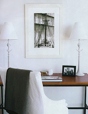 The downstairs guestroom has a leather topped desk and a photograph taken by a Navy admiral who was a family ancestor.

 The dining chairs look blue but are really gray. Another variation on the colors through out the home and take their cue from the colors of seashells and the colors of the beach.
 The kitchen has a more industrial feel but Berkus says, "I like things with a touch of the industrial." The floors are softened with seagrass rugs. I think this home is going to have to go into my file of inspiration for my future beach house. It's perfect!


 Nate may not use a lot of pattern but he does use a lot of great textures and color combinations. There are a lot of colors in the room above but it's still harmonious and soothing.
.jpg)
 The porcelain Nymphenburg rhino on the mantel above looks like the one Nate has on his desk in his New York apartment. I wonder if it's a coincidence or if they borrowed it for the photo shoot.


.jpg)
