Showing posts with label interior design. Show all posts

Wednesday, June 15, 2011

ART IN THE HOME

I've decided it's time for me to consider investing in some art. I love how it can give complete direction and focus to a room - or vignette - in the home. While I'll have to wait until I get into my new apartment to really start decorating, until then, I've been doing my research!
art in the home1
I'm finding so much inspiration in interiors and artists who I've had bookmarked for a while, like Sally King Benedict (top right) and talented friends like Jen Ramos of Cocoa & Hearts, and my favorite Nicole Cohen of Sketch42 (bottom left).
art in the home2
I'm also head over heels for pretty much every piece by Yolanda Sanchez and recently discovered Wendy Letven's 'Water, Land Air' series as well. The big question is do I go soft and let the art work with some of the pieces I already have, or do I go bold and mix things up, regardless of color scheme? That, we will have to wait and see.

For more of my favorite artists and picks, you can also follow my pinterest art board!

*rooms: kate schintzius via design sponge, interiors mag, veranda and suzanne kasler

Monday, June 13, 2011

BURL-ESQUE

Have I ever mentioned how much I love burled wood? The richness of the texture just does me right in...
burled wood
I think I might need to add a few burlwood frames to my collection. It might be a good place to start until I can afford the sofa.

*frame photo via small shop studio

Wednesday, June 8, 2011

UNDERSTATED

This is kind of space I'm willing my head to be in right now...
34984278_yDXN1oW4_c
391_3_12gbath
Clear of clutter, absolutely fresh, and focused on the important things. Like bold wall decor. And leafy accents (whether gilded or recently plucked from the garden).  And great seating (even in the form of a miniature stool).

*images via here, here and here.

Thursday, June 2, 2011

Parisian Dream

I'm swamped with work so until I can take a breath and write a post, I encourage you to head over to The New York Times. I loved the story of a designer who bought a little house in Paris.  It's also a great reminder that it's never to late to make your dreams come true. 

Wednesday, June 1, 2011

LILAC + TANGERENE

Some of you may remember that back in January I started dreaming of office space for coco+kelley. Well... the space I had in mind fell through, but I'm determined to find something this summer, and can't wait to decorate! Which - of course - means that I'm dreaming up color palettes...
lilac+peach+color+inspiration
Just like my home, I imagine I'll want to switch things up in the office here and there, but I do think having a color scheme that I'm drawn to, but might not want in the house, is a great possibility. Which is why I'm seriously considering a little lilac with punches of tangerine...
lilac+peach+room+inspiration+office+livingroom
I really love the mix of modern with Moroccan influences, and the one piece I've had on my wish list for some time  now is the sofa from Crate & Barrel which happens to come in lilac as a stock fabric option (they also have a desk I'm drooling over). I'd love to have a corner of the office space be a sitting area where anyone can get comfy and settle in on the laptop or with coffee and magazines when we need a little break from work - and these pieces would be a fabulous start! What do you think of this scheme?

*images: via veranda, bijou and boheme, and elle decor *room inspiration: lamp by robert abbey, pillow at villa home, azure sofa at crate & barrel, white linen chair z gallerie, inlay table at horchow

Chic in Barcelona

I always think it's sweet when my readers send me links to something they think I would like.  They are usually correct and I have to thank Pablo for alerting me to this great apartment.  It was designed by Ana Ros and although it looks French, is actually located in Barcelona. If you speak Spanish, you can read more details about it online at Nuevo Estilo.  I absolutely love the turquoise commodes that flank the fireplace but would probably switch out the contemporary sofa if it were my home.  But I wouldn't change a thing about that terrace.  Enjoy!


Photos from Nuevo Estilo

Thursday, May 26, 2011

ROOM OF THE WEEK: 5.26

When blogger had it's little *ahem* 'accident' a couple weeks back, it deleted this Room of the Week post.  So I brought it back! Because this room really is quite deserving, in my opinion...

There are a few colors I'm consistently drawn to wherever I go, and coral happens to be one of them (you may have noticed). I have loads of it in my wardrobe, but hardly any in my home. Every time I've tried to bring it in, it feels just a little too loud and overpowering. But I think I may have just found the solution...
veranda.coral
Given a room all its own, the color blocking combination of coral and peach feels just right, and extremely fresh against all the white! I love the updated traditional styling of the room - simple rich wood chairs, beautiful white walls with lovely molding, and antique accents. Nothing too stuffy or over-the-top here. The addition of the potted urn atop the modern white column, however, might be the final piece pulling it all together. The room needs that dash of greenery to give it a softer, garden feel.

PS - If you hate the peach, you can swap it out - bonus!! What color or pattern would you rather see on the table? 

*room featured in veranda via mfamb

Wednesday, May 25, 2011

INTERIORS TO INSPIRE: PASTEL PALACE

Ok so it's not really a palace, but it might as well be. This Parisian apartment (belonging to a Baroness - and a gift no less!) is absolutely dripping in soft pastels. But - before you prepare yourself for a too-sweet  pied-à-terre - you'll be surprised to find a healthy dose of inky black for a little juxtaposition...

Lavender colored walls are a delight with dandelion trim, but the edgy stone table, dark floors and graphic carpeting are the perfect balance.

As we move to the living room the upholstery sings some sweet little blues (and violets!). Historical artwork, classical detailing, and an ocean colored accent wall keep the room sophisticated.

We won't forget the bedroom, because those walls are too good to keep a secret (the detail is even on the door!), the mood here is appropriately more serene, but pastels are still consistent in the lavender bedding.

To use this look to inspire a space, we'll use mostly solids (really the only large print is in the carpet), and mix in a healthy dose of black to a foundation of easy pastels.


Ohhhhh, how I love. I can see myself happily enjoying macaroons and the occasional glass of absinthe here, because it's half mystery and half sweet, don't you think?

Cheers!
-Julie

*Resources from top: Yellow abstract art, tiered chandelier, tufted sofa, velvet purple slipper chair, spotted bowl, yellow x-bench, octagon mirror, yellow ginger jar lamp, printed pillows, gilded antique console, curved bench, sky blue greek key rug. Images via AD Russia, sourced here

Monday, May 23, 2011

RUE ISSUE #5 : IT'S LIVE!

You guys. I am SO happy with this issue... I can't wait to see what you think! We slimmed things down a little - going for quality over quantity - and I think it shows.
IMG_0496
I was thrilled to see my friend Corinne's home (which I originally visited over three years ago, swearing I would photograph it someday!) featured so beautifully. Her style is simple but statement-making. Definitely one of my favorite editorials.
Picture 2
The theme for the issue is entertaining, and on top of a playful little spread, we also feature this very Rue take on weddings that's so chic and refreshing. If I were a bride, I'd be a saving every one of these photos! (I'm already dreaming of ways to use that huge paper chandelier!)
Picture 3
With plenty of pretty styling moments to start adding to your inspiration boards, I can't even begin to share all my favorites - go take a peek for yourself and enjoy Rue Issue #5!

xo cassandra

Thursday, May 19, 2011

ROOM OF THE WEEK 5.19

I thought it only appropriate that today's Room of the Week be punctuated with vibrant yellow on such a sunny day...
pinterest.redonlineuk
I have a feeling this is going to be a love it or hate it for most of you! While I'll fully admit that I don't find the space relaxing (or functional) enough for my personal bath, it would be fantastic in a larger home where you can get playful with all those spare rooms floating around. Or a hotel, for that matter. But that's the point of this series, right? Incredible designs that make you go 'wow', and this one sure did it for me.

The yellow sink was the icing on the cake - it looks like the paint is dripping from the ceiling and wall right down the drain. The triple mirrors was an interesting choice. I think I would have just continued the wrap around mirror that's above the bath on one side, and left the right side empty (or maybe some very sleek floating shelving?)

Soooo - love it? Or hate it? Either way, it is quite the room!

*room via red online via pinterest

Wednesday, May 18, 2011

ON THE HUNT: MARBLEIZED TEXTILES

I'm loving the dreamy effect these marbleized textiles have in two very different bedrooms...
interiorsmag.bedroom
newtrad.bedroom
With one suite composed withe elements of unabashed glamour and the other in quiet neutral modernism, the pattern works perfectly in both. Consider me sold (and hunting for resources!).

*rooms via interiors magazine and trad home

Tuesday, May 17, 2011

THE GOODY BAG: LESSONS FROM LCDQ

It's Alissa from The Goods Design here with The Goody Bag, bringing you the best of Los Angeles' interior design events, people, places and things! Last week I had the pleasure of attending LCDQ- LA - an annual get together at the La Cienega Design Quarter, where some of the best design shops in town are located. It was two days filled with design panels, fiestas and gorgeous goodies.
01_welcome
While the actual goody bags were a bit lacking (an orange tote and design magazines from all the sponsors,) the real take-away was the amazing lessons about interior design that I learned from the panels...

LESSON #1: BE AUTHENTIC

Whether your style is mixing antique pieces with modern furnishings, or simple and edited interiors, be true to yourself. One of my favorite panels was Style Trumps Trend which included amazing designers Jeff Andrews, Brad Ford and Madeline Stuart. The overall vibe of the panel was about staying timeless and avant garde, something we all strive for. While we've all (including me) been cuckoo for ikat and chevron, how do we keep our interiors from looking dated in another 5 years? Madeline Stuart suggests mixing antiques with more modern pieces, so that you can't pinpoint a room to a specific moment in time. But I thought Brad Ford summed it up well "the best design is authentic design."

A look at some of my favorite panelists...
01_designers
*clockwise from top left: Madeline Stuart, Jeff Andrews, Gulla Jonsdottir - she spoke on a panel about what "modernism" means today, Brad Ford & Windsor Smith

LESSON #2:
LA DESIGNERS ARE WELL DRESSED.
COME PREPARED.
01_welldressed

LESSON #3:
LEARN THE RULES.  THEN BREAK THEM.


Study the masters. At the Style Trumps Trend panel, the amazing designers were constantly referencing the amazing designers who had influenced them. Knowing the history of design can teach you the rules, so you can break them and find a style that's uniquely your own.

Windsor Smith (someone I consider a real design guru) talked about a new Showcase House she's doing with Veranda at the panel Redefining Luxury for Today's Modern Family. She is doing away with the old model for homes and using the showcase house to "reinvent and redefine what we need in a house today." She feels like technology is separating us, so now more than ever we need our homes as a way to keep us connected. No more his/hers master bathrooms. No more prime real estate to formal dining rooms we never use. "The kitchen is our new family room," she says. Her showcase house opens in June 2011 here in LA (cannot WAIT to see it!) and will be featured in the October 2011 issue of Veranda.

I saw lots of bold design throughout the showrooms...
01_bebold
Clockwise from top left:

1. Designers were selected to curate different store windows throughout the event - I loved this one by Ruthie Sommers with the bold red stripes and pops of yellow! Totally unexpected and adorable!
2. Gorgeous brass sunburst light fixture from the Nanz Hardware/Remains Lighting showroom. Would be a gorgeous and bold statement fixture in an entry.
3. Loving these geometric cookies served at Mecox Gardens. The bright color combos were lovely (and they were so cute, I didn't dare take a bite.)
4. I am totally obsessed with this vignette I saw at the Szalon showroom. Hanging a beautiful patterned woven rug on the wall, then hanging a portrait over it? Definitely breaking the rules. In the best way.

See you next year LCDQ-LA!

Tuesday, May 10, 2011

INTERIORS TO INSPIRE: GLAMOUR IN SQUARES

Who woulda thought? A regular ol' square imparting so much glamour, by just by using a simple design principal - Repetition.

Hello ladies (and gents), Julie here, bringing you a space that will make you wish you were sipping a mojito in a gilded glass. Welcome delightful, airy glamour with a strong dose of graphic pop - just what the doctor ordered leading into summer.
The powerful rug anchors the space and sets the tone for high style, but won't be outshadowed by the statement-making vintage sky blue chair. You can already see the square pattern being used throughout the home, starting here.
Vintage brass and playful yellow are found scattered throughout the house, making the strong black, white and blue palette feel cheerful and easy to lounge in - reflecting the feeling of the sunny outdoors that this room opens up to! 
This is just one of several bedrooms employing more graphic pop, and I love the Missioni inspired throw and fretwork wall paper. (And proof that a headboard can reside against a window, which is personally, my fave spot.)

Jonathan Adler is the king of this style, so using a few of his pieces to recreate the look and feel of this home is the perfect starting point.


Mixing in some brass and fun vintage pieces quickly adds interest and depth.


Yellow x-benches had me at hello. And the brass silverware has long been on my wishlist!

The great thing about this style is it is absolutely reasonable to have in your own home, which is a bonus, because sometimes we know things are pretty, but just not right for us. This style, however, is easy to replicate and enjoy!

Cheers!

-Julie

*resources: Adler J Pillow, white tufted chairs, rams head coffee table, bamboo square lamp, Kagan cloud sofa, yellow X benches, three-arm lamp, lion scuplture, blue pillow, black and white trellis rug, brass serveware, smile! pillow. images via here. Interior Design by Greg Natale.

Monday, May 9, 2011

LIONS AND DINING ROOM CHAIRS, OH MY...

This table deserves a fiesty roar... 
via onewhiteapron
I'm dying over the intricate lion-head (and feet!) legs. And the complimenting modern chairs are almost perfect - I would have gone with something even more simple (maybe armless?) to really let the table shine. It's so good in this clean, all-white space. 

*image via one white apron

Thursday, May 5, 2011

ROOM OF THE WEEK: 5.5

I've got one thing to say about this kitchen...
ericpiasecki6
Hardware. It's totally what sold me on it. The pop of brightly polished brass off that soft grey gets me every time! Oh, and yes the rest of the kitchen is divine as well - let's talk about it, shall we?

First off - the dark grout with the white subway tile. I'm not always a fan, but in this case I really love it. It keeps the room from being too glaringly white and adds graphic interest - but does it need to be all the way up every wall? Hmmm. The natural lighting is also heavenly - skylights in the kitchen are one of my favorite things! And how smart to mount the overhead lighting in there too. (Speaking over overhead lighting - that fixture about the dining table is freaking me out. No thank you.) The hood is perfection, the marble-topped island delicious, and the smattering of houseplants quite refreshing. I even spy a peek of a bar cart, which is always on my must-have list! All in all... I'd happily move right in!

What do you think? Favorites? Not so favorites?

*image by eric piasecki

Wednesday, May 4, 2011

BETTER THAN THONET?

I've been on the hunt for some casual dining chairs for a client of mine, and I keep returning to the classic Thonet bentwood style.
thonet+bentwood+chair black+white+green
I love them all lacquered up and shiny, and their shape is perfection... unless of course you're worried about little squirmy kiddos slipping through the open design. Which, in fact, we are. The solution?
20580924_010_m1
Well, it just might be these - the new Henri dining char at Anthropologie. I don't love the design as much, but they're still pretty darn good. And I do love the option of that deep navy blue instead of black! What do you think of them? Any other suggestions from my design friends out there?

*black and white chairs from crate&barrel, green thonet chair at dwr

KEEP IT LOOSE... KEEP IT LIGHT...

In an attempt to hold onto the little bit of peace I felt after a relaxing long weekend, I'm taking deep breaths and clearing space in my home, my mind, my life... everything...
Alexandrangle.bednook2
I'm taking moments to lay in the sun (if only briefly), to allow myself to dream (just a little), and to prioritize the things that are most important...
arizona-muse5
To make plans, but keep a few days open for spontaneity...
Kitchen of the Month House Beautiful April 2010 William Hefner Designer
To take the time to relish in a good meal with friends, or bask in moments of silence...
Brooke Coffey in These Days for Fashion Gone Rogue
And most importantly, to be able to walk away from things when it necessary... out of the heavy burden of unhealthy relationships, stressful workdays, and even gloomy weather. Life is too short to have to shoulder it all, when so many better possibilities await!


*images via alexandra angle, arizona muse by benjamin alexander huseby, house beautiful via splendid sass, and brooke coffey for fgr

Tuesday, May 3, 2011

IN THE DETAILS: KIPS BAY SHOWHOUSE

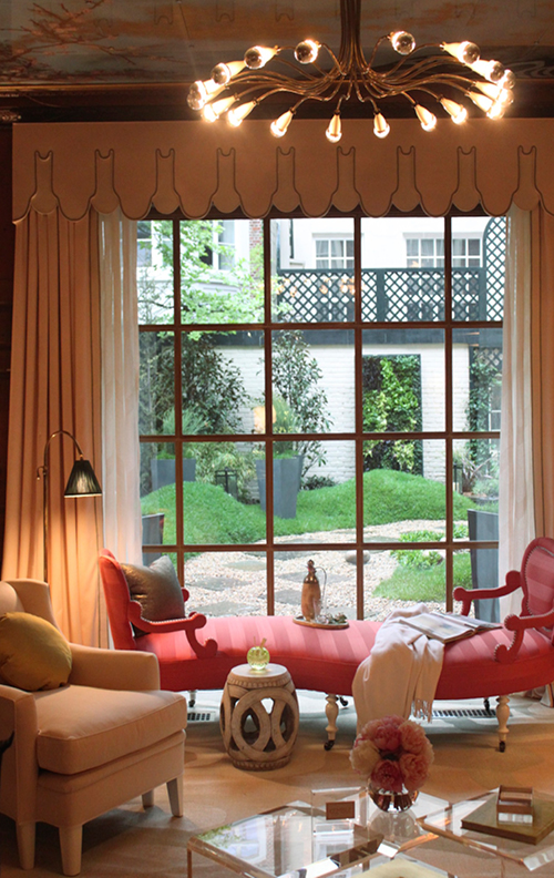
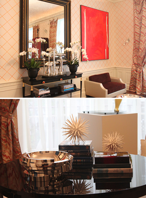
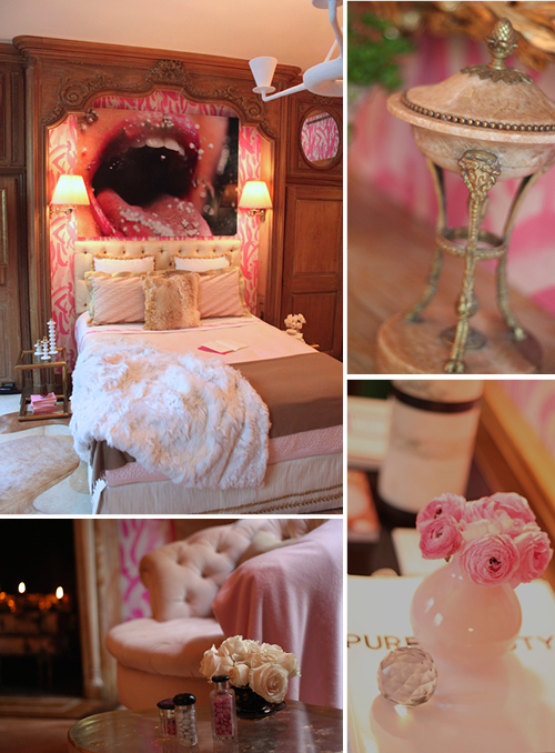
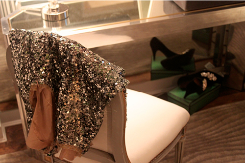
Hello readers, Crissie here, from bug&Bear! Last week I had the opportunity to stop by the Kips Bay Decorator Show House, and I'm here to today to bring you a few of my favorite details!

The Show House, a neo-Federalist style home on the Upper East Side of Manhattan, is decorated every year by a group of top designers to benefit the Kips Bay Boys & Girls Club. Each room reflects the individual style and taste of designer in charge of it's appearance, giving the four story mansion a very eclectic and exciting feel.
5677915503_660f0a630c_o
The Library, designed by Kemble Interiors 

Living Room, by Richard Mashaan Design

Master Bedroom (so fierce!) by Amanda Nisbet Design, Inc

Guest Room (with a very dreamy ceiling), by Barbara Ostrom Associates, Inc

A moment of glam in the Master Dressing Room, by Cayley Barrett Associates 

What's your favorite room or detail??