I love the way these fabulous ladies (Sterling Style and Atlantic-Pacific) layered up their preppy gingham with chunky jewels and masculine army jackets to toughen things up. Add in touch of this spring's hottest trends (open weave knits and florals) and you've got two seriously winning combinations. Do it up, girls!
Showing posts with label color trends. Show all posts
Wednesday, March 30, 2011
GINGHAM + MILITARY + PILES OF JEWELS
It's official. Two of my favorites are doing it, so you know it's good...


I love the way these fabulous ladies (Sterling Style and Atlantic-Pacific) layered up their preppy gingham with chunky jewels and masculine army jackets to toughen things up. Add in touch of this spring's hottest trends (open weave knits and florals) and you've got two seriously winning combinations. Do it up, girls!
Thursday, February 17, 2011
FASHION WEEK: COLOR LOVE
Hi lovelies, Crissie from bug&Bear here to share with you one of my favorite parts of fashion week- color trends. I could (and do...) spend hours browsing the latest collections, looking for fabulous color combinations. Here are a few of my favorites so far for fall...
An almost calming mix of dusty rose and deep azure at Rebecca Taylor (top row), and rich grays and greens (with pops of red) at Steven Alan (bottom row). Plus- leopard print gloves? Fierce.
And, oh my, I can't get enough of orange and blue, it has such a fresh feel, and mixed with metallic pants? Perfection by Peter Som (top row). Jenni Kayne's collection (bottom row) delivers a stunning mix of mustard and turquoise that feels casual but still chic. Fall is shaping up to be a very colorful season!
*images via style.com
Labels:
color trends,
fashion,
fashion week,
jenni kayne,
peter som,
rebecca taylor,
runway,
steven alan
Wednesday, July 21, 2010
COLOR TREND: CITRON POP
Imagine a mustard yellow in all its richness taken to a shade so bright that it mimics gold, and that is the color I'm currently obsessed with. I suppose I'll call it citron, but it seems to have several levels of depth, all of them vivid, modern and stunning...

Of course the main question is - what does one pair with this strong color? Well, first off, let's start by saying that citron is the pop - not the base. I love it as an accent to shades of greyish blues, seashell pinks and nudes, and a dramatic black or rich brown.

A popular choice on the runways for the resort collections, it pairs freshly with white for summer, but is given more character and depth with the addition of some of these other color selections as well.

And - while quite intuitively modern in most settings - citron makes a beautiful choice for dramatic traditional settings as well. In fact - the upholstery on the antique accent chair in my living room could be considered a shade of citron! Pair it with gold and bronze to make the color shine through.
I can't wait to see how gorgeous it looks against deep teals and aubergine for fall, too!
*images via elle decor, marie claire maison, style.com (celine resort 2011), and martha stewart.
Of course the main question is - what does one pair with this strong color? Well, first off, let's start by saying that citron is the pop - not the base. I love it as an accent to shades of greyish blues, seashell pinks and nudes, and a dramatic black or rich brown.
A popular choice on the runways for the resort collections, it pairs freshly with white for summer, but is given more character and depth with the addition of some of these other color selections as well.
And - while quite intuitively modern in most settings - citron makes a beautiful choice for dramatic traditional settings as well. In fact - the upholstery on the antique accent chair in my living room could be considered a shade of citron! Pair it with gold and bronze to make the color shine through.
I can't wait to see how gorgeous it looks against deep teals and aubergine for fall, too!
*images via elle decor, marie claire maison, style.com (celine resort 2011), and martha stewart.
Labels:
color,
color trends,
yellow
Monday, July 12, 2010
INSPIRED TRENDING
Whenever I'm in need of an inspiration refresh, I sit down and go through my files, pulling out the images that are speaking to me the most. Going through more current tear sheets usually results in a trend-inspired bulletin board (which I'll be sharing with you soon!), but perusing my older digital files helps me see how my mind is processing old details in new ways or what styles I'm being drawn to most as we head into the next few months...
July:

Summer has finally graced us with its presence and I'm in a whitewashed state of mind with accents of apricot and pistachio that welcome beach inspired living. There's a movement to everything as doors are opened wide to let in cool breezes and visitors...
August:

There's a stillness to that final full month of summer. The natural light floods in and we relish quiet moments away from our busy calendars, languid in the heavy light. Neutrals laced with rich blues and pretty patterns still feel fresh, but there's a richness that seeps in along with the shorter days...
September:

Richer tones start to reappear as the seasons begin to change. Not quite ready to give in, we stick with a playful fuchsia the color of berry stained fingers that still remind us of summer, pairing it with casual stripes or fresh white to keep things light as we start to cozy into fall...
*rooms via lisa sherry, martha stewart, domino, tumblr, unknown, sharyn cairns, domino, decorpad
July:
Summer has finally graced us with its presence and I'm in a whitewashed state of mind with accents of apricot and pistachio that welcome beach inspired living. There's a movement to everything as doors are opened wide to let in cool breezes and visitors...
August:
There's a stillness to that final full month of summer. The natural light floods in and we relish quiet moments away from our busy calendars, languid in the heavy light. Neutrals laced with rich blues and pretty patterns still feel fresh, but there's a richness that seeps in along with the shorter days...
September:
Richer tones start to reappear as the seasons begin to change. Not quite ready to give in, we stick with a playful fuchsia the color of berry stained fingers that still remind us of summer, pairing it with casual stripes or fresh white to keep things light as we start to cozy into fall...
*rooms via lisa sherry, martha stewart, domino, tumblr, unknown, sharyn cairns, domino, decorpad
Labels:
color trends,
decor trends,
interior design
Tuesday, June 15, 2010
COLOR TREND: COPPER + ROSE
With nude tones gaining in popularity this season, it seems only logical that metallic accents in copper and rose will rise to the top of decor and accessory trends...
The next time you do a little shopping, skip the usual silver and gold and get a piece that's a bit more original, whether for the home or the wardrobe. I especially love the way this tone pops against white walls and compliments a late summer tan...
*clock at target, pendant light by tom dixon at ylighting, ray ban aviators, michael kors watch, sandals by stella mccartney, and for good measure, a gorgeous rose dress from emilio pucci
The next time you do a little shopping, skip the usual silver and gold and get a piece that's a bit more original, whether for the home or the wardrobe. I especially love the way this tone pops against white walls and compliments a late summer tan...
*clock at target, pendant light by tom dixon at ylighting, ray ban aviators, michael kors watch, sandals by stella mccartney, and for good measure, a gorgeous rose dress from emilio pucci
Labels:
color,
color trends,
metallics
Monday, May 17, 2010
MORE TO MAUVE
When was the last time you used the term 'dusty rose' without cringing? Well, get used to it darlings, because mauve is back... and better than ever.
In stark contrast to the summer brights, mauve might not be the most exciting option for accessories and walls, but these pale lilac pink tones are quite soothing and flattering, and will pair well with citron yellow and spring green to transition from summer to fall.
*rooms via house to home and martha stewart, dress by vivienne westwood, ring by mark davis, purse by marni
In stark contrast to the summer brights, mauve might not be the most exciting option for accessories and walls, but these pale lilac pink tones are quite soothing and flattering, and will pair well with citron yellow and spring green to transition from summer to fall.
*rooms via house to home and martha stewart, dress by vivienne westwood, ring by mark davis, purse by marni
Labels:
color,
color trends
Wednesday, March 17, 2010
SPRING COLOR: PANTONE'S PALETTES FOR THE HOME
Last year, I did a short postpairing Pantone's Fall 2009 Color Report with interiors reflecting various color combinations drawn from their predictions. Well, guess what? This series is back!
Using Pantone's Spring 2010 report, I've discovered some lovely little rooms to provide us with beautiful, seasonal inspiration in unique palettes...
I adore this feminine, Indienne inspired bedroom belonging to textile designer Lisa Fine with its unexpectedly soft palette - a departure from the saturated tones we usually see for this style.
One word for this living room - fresh fresh fresh!
One of Kelley Wearstler's more simplistic designs, this bedroom still packs some punch!
Pistachio walls? It may not be for everyone, but the color certainly acts as an interesting neutral to the room. Pops of red and orange provide warmth and interest... there's even a touch of lilac!
Proof that you don't have to interpret a suggested palette literally. Other than the dominant blue, the only hint of color here is the subtle glow of aqua, yellow and peach coming from the stained glass window.
Traditional and quirky, there's something about this room that makes me smile. The bravery it must take to place urns on teensy shelves next to the bed, perhaps? Or maybe it's just the playful contrast of blue and shades of coral.
Strangely enough, I pulled this room for the same post last year... but it works even better for the spring palettes! Consider it an all-time favorite... I'm sure you'll see it again!
*rooms via *1. elle decor *2. unkown *3. kelly wearstler *4. mark lund *5. photographed by virginia macdonald for style at home *6. via topsy turvy *7. jay jeffers
Labels:
color,
color trends,
interior design,
pantone
Tuesday, December 1, 2009
A LITTLE LILAC LOVE
Ever since this post, I've been completely obsessed with the combination of lilac + red...
Whether it's a vibrant pop of red lipstick or a trail of ruched flowers down a delicate dress...
It's quite possibly my new favorite tabletop inspiration for its complete originality and surprising softness - a perfect alternative holiday setting, don't you think?
On top of that...
There's this gorgeousness. Lilac with a rusty tone seems almost just as good.
Even in this room of pastels, the lilac is balanced so well by bronzes and natural wovens. And while were at it... how about those topiaries??
*runway looks by luisa beccaria and alberta ferretti, images by randi brookman harris (via decor8), elle decor and bilhuber
On top of that...
*runway looks by luisa beccaria and alberta ferretti, images by randi brookman harris (via decor8), elle decor and bilhuber
Labels:
color,
color trends,
lilac,
purple
Monday, August 31, 2009
Fall Palette Inspiration from Alexa Chung
I'm mildy obsessed by color palettes right now in two areas - one of which is my fall wardrobe, and the other of which I'll be sharing very soon. The days here in Seattle are starting out foggy and cool, which is a sign of the grey weather to come and a calling to update the closet with some cozy pieces...
Stumbling across this editorial in Marie Claire featuring the adorable Alexa Chung and her picks for fall, I was immediately drawn in by these two shots - not just for the clothing, but the setting too! The gorgeous color of that chair, the black grout setting off eggshell white tiles, pinstripe wallpaper and rich leather...
Last year I was more focused on being more adventurous with color, but this year I think I'll concentrate on more luxurious pieces in rich neutrals and adding a few accents like olive green, mustard, and a toned down coral... in my home and my wardrobe!
Labels:
color trends
Wednesday, July 1, 2009
India In Black+White
With all the rich color that comes from eastern cultures like Morocco and India, there's something to be said for a little inspiration in black and white...
I find these selections refreshing and bold in a way that's not too overpowering, not to mention I love the way that the patterns really take center stage.
*wallpaper by julien macdonald, bedding by amy butler, interior for aussie vogue living, via apartment therapy
Labels:
black and white,
color trends,
pattern
Monday, June 29, 2009
Color Inspiration: Coral + Black
The combination of these colors creates such a glamorous intensity, don't you think? Not quite as harsh as black and red, a touch of coral with rich wood tones and black seems like a fabulous summer combo to me...
*images via house beautiful, unkown, saipua
Labels:
color palettes,
color trends
Wednesday, June 17, 2009
Color Inspiration: Summer + Succulents
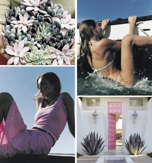
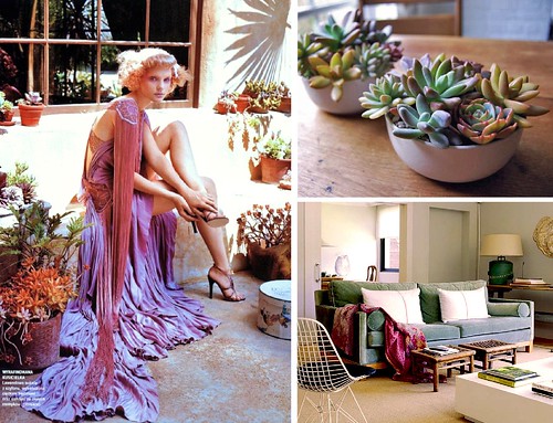
The colors of sweet succulents have been inspiring me lately with their soft muted tones that evoke warm days of summer from morning to night...
*photo via i know what you wore, room via nuevo estilo
*photography pucci ad campaign, room frank roop
Labels:
color palettes,
color trends
Friday, June 5, 2009
Happy (Colorful) Weekend!
Thank you all for such a fun little week at coco+kelley! It was nice taking the time this week to look back through some of my favorite posts and finds and have a fairly mellow little blog birthday! One last look at the archives to leave you with... a rainbow of 'Color Me' posts...
Get some color this weekend!!
Much love,
Cassandra
Much love,
Cassandra
Labels:
color me,
color trends
Thursday, April 2, 2009
Aqua + Yellow
When I found this photo via the Sart, I had to save it for some inspiration. I'm never brave enough to combine two bright colors together without something to break them up - but obviously it works! (Note the chocolate brown clutch though - that's key!)
I had a dress this exact color that I wore to almost every wedding one summer - it's a fantastic shade that looks good on almost anyone! I'd love to recreate this style...
If there was a dress that would make me do it, it might be this one from Black Halo. I'm all over the asymmetry! Paired with a fab pair of yellow sandals (maybe not so much these Jimmy's, but something a bit more affordable) this look would be hot for a mid summer LA wedding... too bad mine are all in the Northwest!
This color combo is also daring in decor, but these are great examples of different ways to do it: elegant, retro, eclectic and with accessories.
*all rooms via domino, except the retro one... anyone know the source?
I had a dress this exact color that I wore to almost every wedding one summer - it's a fantastic shade that looks good on almost anyone! I'd love to recreate this style...
If there was a dress that would make me do it, it might be this one from Black Halo. I'm all over the asymmetry! Paired with a fab pair of yellow sandals (maybe not so much these Jimmy's, but something a bit more affordable) this look would be hot for a mid summer LA wedding... too bad mine are all in the Northwest!
This color combo is also daring in decor, but these are great examples of different ways to do it: elegant, retro, eclectic and with accessories.*all rooms via domino, except the retro one... anyone know the source?
Labels:
aqua,
color trends,
fashion inspiration,
rooms,
yellow
Monday, March 16, 2009
Not Your Sister's Seafoam
Forget the horror stories of seafoam green bridesmaid dresses. This color is back in a whole new way. When paired with the popular neutrals of this season, seafoam becomes soothing and simple...
Or, play up the retro classic quality of this color by pairing it with creams and a pop of true red as inspired by this relaxed dining room...
*1. room via cote sud *2. top by elizabeth+james, pants by donna karan, shoes by lanvin, all via net-a-porter, *3. bracelets via vivre, *4. magnolia barrette via blossoms on etsy.
Or, play up the retro classic quality of this color by pairing it with creams and a pop of true red as inspired by this relaxed dining room...
*1. room via cote sud *2. top by elizabeth+james, pants by donna karan, shoes by lanvin, all via net-a-porter, *3. bracelets via vivre, *4. magnolia barrette via blossoms on etsy.
Labels:
color trends,
rooms from the runway
Thursday, March 12, 2009
In The Navy
Forget black for spring - navy is what I'm feeling these days...
I'm especially loving it in natural fabrics, and paired with creams and camels. (Getting away with navy blue slacks and brown shoes however... I'm not so sure about.)
*1. outdoor room via domino *2. street style via sartorialist *3. monogram linen on etsy by chez sucre chez
I'm especially loving it in natural fabrics, and paired with creams and camels. (Getting away with navy blue slacks and brown shoes however... I'm not so sure about.)
*1. outdoor room via domino *2. street style via sartorialist *3. monogram linen on etsy by chez sucre chez
Labels:
color trends,
navy
Tuesday, March 3, 2009
Taking Pantone's Fall Palette to the House
For some reason, I was super inspired by Pantone's Fall 2009 Fashion Color Report this year. Maybe it's because the color combinations are endless and exciting? Or perhaps it's because a few of these palettes match some of my absolute favorite interiors...
room by erinn valencich
This combination of colors has to be one of my all time favorites - in fact, it's exactly what I've been going back to in my bedroom! Earthy, warm shades with a touch of grey. Done to perfection above, and interpreted with a few other colors below...
I also love this unexpected grouping of a deep teal blue with an old-fashioned rose colored pink and a dash of modern olive green (more like a chartreuse if you ask me!) And, of course, a neutral cream to balance them all.
And, we cannot forget the red and purple hues that will continue to be strong this year. My favorite is actually to pair them together, like this room above. Such royal richness!!
room by erinn valencichThis combination of colors has to be one of my all time favorites - in fact, it's exactly what I've been going back to in my bedroom! Earthy, warm shades with a touch of grey. Done to perfection above, and interpreted with a few other colors below...
room via aussie vogue
I also love this unexpected grouping of a deep teal blue with an old-fashioned rose colored pink and a dash of modern olive green (more like a chartreuse if you ask me!) And, of course, a neutral cream to balance them all.
room via domino
And, we cannot forget the red and purple hues that will continue to be strong this year. My favorite is actually to pair them together, like this room above. Such royal richness!!
Labels:
color trends,
rooms
Tuesday, February 17, 2009
Grey + Stripes = Perfection
I've had the soothing yet preppy combo of grey and white stripes on the brain lately...
Considering the grey trend will probably be a strong one for weddings this year, I think this tabletop setting would be a lovely idea for a the seaside - very Hamptons-esque, don't you think? And a sprinkling of white and grey pillows for my bedroom would indeed be perfection.
tabletop via social design, pillows by madeline weinrib
Considering the grey trend will probably be a strong one for weddings this year, I think this tabletop setting would be a lovely idea for a the seaside - very Hamptons-esque, don't you think? And a sprinkling of white and grey pillows for my bedroom would indeed be perfection.tabletop via social design, pillows by madeline weinrib
Labels:
color trends,
grey,
tabletop